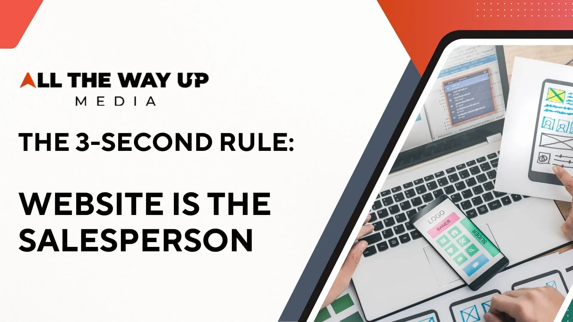
Imagine hiring a salesperson for your business. You give them a prime office, a limitless budget for business cards, and the best suit money can buy. But there is a catch: when a potential customer walks in the door, this salesperson ignores them for five seconds, speaks in a language the customer doesn’t understand, and then hides the pricing information in a filing cabinet in the basement. How long would you keep that salesperson on your payroll?
What Is The 3-Second Rule
In the physical world, you would fire them immediately. Yet, in the digital world, countless businesses in Toronto and Cape Coral tolerate exactly this behavior from their most visible asset: their website.
We live in the age of the Impulse Generation. The modern consumer is ruthless with their time and quick to judge. When a potential client clicks on your Google Ad or finds you via organic search (SEO), a silent, invisible stopwatch begins ticking. This is the domain of The 3-Second Rule.
If your site cannot load, engage, and communicate value within three seconds, the battle is lost.
At All The Way Up Media, we don’t just build websites; we build revenue engines. We understand that the difference between a business that survives and one that thrives is often the difference between a “pretty” website and a “profitable” one.
This comprehensive guide will walk you through the psychology of user behavior, the science of conversion, and the rigorous engineering required to turn your website into your top-performing employee.
Part 1: The Anatomy of the 3-Second Rule
The “3-Second Rule” isn’t an arbitrary number we invented. It is a biological and technological threshold defined by how the human brain processes information in the digital age.
The Speed of Thought (and Abandonment)
When a user visits your site, they are not reading; they are foraging for information. If the “scent” of information isn’t strong immediately, they leave.
- The 0.5-Second Verdict: According to Google research, users form an aesthetic judgment of your website in just 0.05 seconds (50 milliseconds). Before they have read a single word, they have decided if you are trustworthy, professional, and relevant.
- The 3-Second Cliff: The data on load times is unforgiving. Research aggregated by Google indicates that 53% of mobile site visitors will leave a page that takes longer than three seconds to load.
Think about the implications of that statistic. If you are running a Paid Ad campaign in the competitive Toronto real estate market or the Cape Coral construction industry, and your mobile landing page takes 4 seconds to load, you are essentially burning 53% of your advertising budget before a prospect even sees your offer.
The “Pretty” vs. “Profitable” Paradox
Many business owners confuse “good design” with “art.” They want sweeping drone videos, complex animations, and high-resolution artistic photography. While these elements can be beautiful, they are often heavy.
- A “Pretty” Site focuses on aesthetics. It asks, “Does this look cool?” It often sacrifices speed for visual flair, leading to high abandonment rates.
- A “Profitable” Site focuses on conversion. It asks, “Does this sell?” It balances visual trust with lightning-fast performance and clear psychological triggers.
At All The Way Up Media, our professional web design services are grounded in profitability.
Part 2: The Psychology of the User
To build a site that converts, you must understand the brain of the person visiting it. You don’t need a degree in neuroscience, but you do need to understand a few key concepts that drive our design decisions.
Lingo Explained: Cognitive Load
What it is: Cognitive Load refers to the amount of mental effort being used in a person’s working memory. Think of it like the RAM in your computer or simpler yet, think of it like a fuel tank.
Why it matters: Every time your user has to pause to figure something out—“Where is the menu?” “Is this a button or a picture?” “What does this company actually do?”—they burn fuel. When the tank hits empty, they get frustrated and leave.
The Rule of 5-9:
Psychological research (often referred to as Miller’s Law) suggests that the average human working memory can only hold 7 (plus or minus 2) items at once. This means if your navigation menu has 15 items, you are actively overwhelming your potential customer.
The Solution:
We design to reduce cognitive load. We use “Chunking”—breaking complex information into smaller, digestible groups. Instead of listing 20 services, we group them into 3-4 logical categories. This keeps the user’s “fuel tank” full, allowing them to use that energy to make a purchase decision rather than navigating a maze.
Lingo Explained: User Experience (UX)
What it is: UX is not just how a website looks; it’s how it feels to use it. It encompasses the speed, the logic of the layout, and the emotional response of the user.
Why it matters: You might offer the best roofing service in Florida or the best legal counsel in Ontario, but if your UX is clunky, users will assume your service is clunky, too.
- Fact: Studies show that 94% of a user’s first impression is website design related.
- Fact: Every $1 invested in UX results in a return of $100 (a 9,900% ROI), according to Forrester Research.

Part 3: The Blueprint of a High-Converting Website
How do we apply this psychology to the actual build? We focus on three critical architectural pillars: Above the Fold, Information Architecture, and Speed Mechanics.
1. The “Above the Fold” Imperative
Lingo Explained: “Above the Fold” is a term borrowed from the newspaper industry. It refers to the top half of the front page—the part you see before you pick up the paper. On a website, it is the screen area visible without scrolling.
The Strategy:
You have 3 seconds. Therefore, your “Above the Fold” area must answer three questions immediately:
- What do you do? (e.g., “Commercial HVAC Repair”)
- Where do you do it? (e.g., “Serving the Greater Toronto Area”)
- What should I do next? (e.g., “Get a Free Quote”)
If your homepage header is a vague, inspirational quote like “Reaching New Heights” with a picture of a cloud, you are failing the 3-Second Rule. You are forcing the user to scroll to find out if you can actually help them.
2. Information Architecture (IA) as a Sales Funnel
Lingo Explained: Information Architecture is the structural design of your shared information environments. It’s the blueprint of your website’s navigation.
Many DIY websites fail here. They dump every possible page into the main menu.
At All The Way Up Media, we structure IA based on “User Intent”.
- Navigational Queries: The user wants to find a specific page (e.g., “Contact Us”).
- Informational Queries: The user wants to learn (e.g., “How much does SEO cost?”).
- Transactional Queries: The user wants to buy (e.g., “Book an Appointment”).
We streamline your menu to guide the user from Information to Transaction with the least amount of friction possible.
3. The Technical Foundation: Speed
A profitable site is an optimized site.
- Image Compression: We ensure high-resolution images don’t act as digital anchors.
- Mobile-First Coding: We write code that prioritizes mobile processors, acknowledging that for most industries, 60%+ of traffic is on a phone.
- Server Response Time: Your website needs to live on high-performance servers. A slow server is like a Ferrari with a lawnmower engine.
Part 4: The Metrics of Failure (And How to Fix Them)
How do you know if your current “salesperson” is underperforming? The data tells the story.
Fact: Bounce Rate
Lingo Explained: A “Bounce” happens when a user lands on your website and leaves without clicking anything or visiting a second page.
The Benchmark:
According to data from Oberlo and other analytics firms, the average bounce rate across all industries is roughly 44%.
- If your bounce rate is over 70%, your site is broken (or your digital marketing campaigns are targeting the wrong people).
- If your bounce rate is under 30%, your site is highly engaging.
High bounce rates usually stem from a violation of the 3 Second Rule. The user landed, didn’t see what they expected immediately, and “bounced” back to Google to find your competitor.
Fact: The F-Shaped Pattern
Eye-tracking studies by the Nielsen Norman Group reveal that people scan websites in an “F” pattern.
- They scan horizontally across the top (Headline/Menu).
- They scan a bit lower horizontally (Sub-headline).
- They scan vertically down the left side (Bullet points).
The Fix: We place your most critical value propositions and Call to Actions (CTAs) directly in this F-path. We never hide important info in the bottom right corner, where the eye rarely travels.
Part 5: The Ecosystem – SEO and Paid Ads
Your website does not exist in a vacuum. It is the destination for all your marketing efforts.
The SEO Connection
Search Engine Optimization (SEO) gets you found. But Google’s algorithm is now heavily weighted toward User Experience.
- Core Web Vitals: Google measures your site’s speed and visual stability. If you fail the 3-Second Rule, Google will actually lower your rankings because they don’t want to send their users to a slow, frustrating site.
- Dwell Time: If users bounce immediately, it signals to Google that your site is irrelevant, pushing you further down the rankings.
The Paid Ads (PPC) Connection
If you are running Google Ads or Facebook Ads, you are paying for every click.
- The Landing Page Gap: A common mistake is sending paid traffic to a generic homepage.
- The Solution: We create dedicated landing pages that match the exact promise of the ad. If the ad says “Emergency Plumber in Cape Coral,” the landing page must say “Emergency Plumber in Cape Coral” in big, bold text—not “Welcome to Smith & Sons”.
Part 6: Localized Success – Toronto vs. Cape Coral
While the psychology of the human brain is universal, the application of these strategies must be localized.
Scenario A: The Toronto Tech Firm
The Challenge: In a hyper-competitive market like Toronto, users are tech-savvy and impatient.
The Fix: For our Toronto clients, we often emphasize minimalist, “dark mode” aesthetics that reduce eye strain and ultra-fast, server-side rendered pages that load instantly on 5G networks. The “Value Proposition” must be concise and data-driven.
Scenario B: The Cape Coral Service Business
The Challenge: In Florida’s service market (HVAC, Roofing, Real Estate), trust and locality are paramount.
The Fix: We utilize “geo-trust” signals Above the Fold. This means prominently displaying local phone numbers (239 area codes), maps, and badges like “Serving Lee County for 20 Years.” The UX focuses on large, thumb-friendly “Call Now” buttons, knowing that many users are searching from their cars or job sites.
Part 7: Table of “Pretty” vs. “Profitable”
To summarize the difference, use this checklist to evaluate your current site.
| Feature | The “Pretty” Site (Low Conversion) | The “Profitable” Site (High Conversion) |
| Headline | Vague, clever, or poetic (e.g., “Synergy in Motion”) | Clear, benefit-driven (e.g., “24/7 Plumbing Repair in Toronto”) |
| Navigation | 10+ menu items, confusing labels | 5-7 menu items, clear labels (Services, About, Contact) |
| Speed | 4+ seconds (heavy video backgrounds) | Under 2 seconds (optimized code & imagery) |
| Mobile | Content is squished; buttons are hard to tap | Custom mobile layout; “Thumb Zone” navigation |
| CTA | “Submit” (generic) | “Get My Free Audit” (value-based) |
| Trust | hidden on the “About” page | Testimonials & badges visible on the Homepage |

Conclusion: Fire Your Underperforming Salesperson
Your website works 24 hours a day, 365 days a year. It never takes a sick day. It never asks for a raise. But if it isn’t optimized, it is costing you a fortune in lost opportunity.
The market has changed. The 3 Second Rule is the new law of the land. You cannot afford to have a digital presence that is merely “pretty.” You need a high-performance machine that respects your customer’s time, reduces their cognitive load, and guides them effortlessly toward a sale.
At All The Way Up Media, we combine the creative art of design with the rigorous science of conversion. From the bustling streets of Toronto to the sunny avenues of Cape Coral, we help business owners turn their websites into their most profitable assets.
Are you ready to stop losing leads to the 3-Second Rule?
It is time to elevate your digital presence.
Call to Action
Don’t let another customer bounce.
Contact All The Way Up Media today for a comprehensive Website & UX Audit. Let us show you exactly where your current site is leaking revenue and how we can fix it.
- Web Development that converts.
- SEO that ranks.
- Paid Ads that deliver ROI.
Contact Us Today for a Free Consultation
Sources & Data Attribution
- 53% Mobile Abandonment: Research by Google confirms that 53% of mobile visits are abandoned if a page takes longer than 3 seconds to load. Google AdSense Help
- 0.05 Second First Impression: Users form an opinion about a website in 0.05 seconds (50 milliseconds). Google Research on Visual Complexity.
- UX ROI: Every $1 invested in UX results in a return of $100. Forrester Research. Forbes Article
- 94% Design Impact: 94% of first impressions are design-related. Research on Credibility Judgments.
- 8-Second Attention Span: The average human attention span is approximately 8 seconds. Microsoft Consumer Insights.
- Cognitive Load (7 ± 2): The capacity of human working memory is limited to roughly 7 items. Miller’s Law / Cognitive Psychology. Wikipedia
- Average Bounce Rate: The average bounce rate across industries is approx. 44%. Oberlo / Industry Benchmarks. Oberlo Statistics